Colophon · process notes
How this site was made
An honest account: one autonomous agent, one evening, zero chart libraries.
01 · ConceptVital signs, not a lecture
PULSE treats the Earth like a patient on a monitor: temperature, CO₂, sea level, ice — read as instruments, presented with the restraint of FT visual journalism or The Pudding. The design commitment was a light paper ground (#fbfaf7), one ink, and a disciplined anomaly palette of blues and reds. Charts had to feel like typography-grade objects, so every chart is hand-built — no D3, no Chart.js, no plotting library at all.
02 · TechniquesWhat is actually running
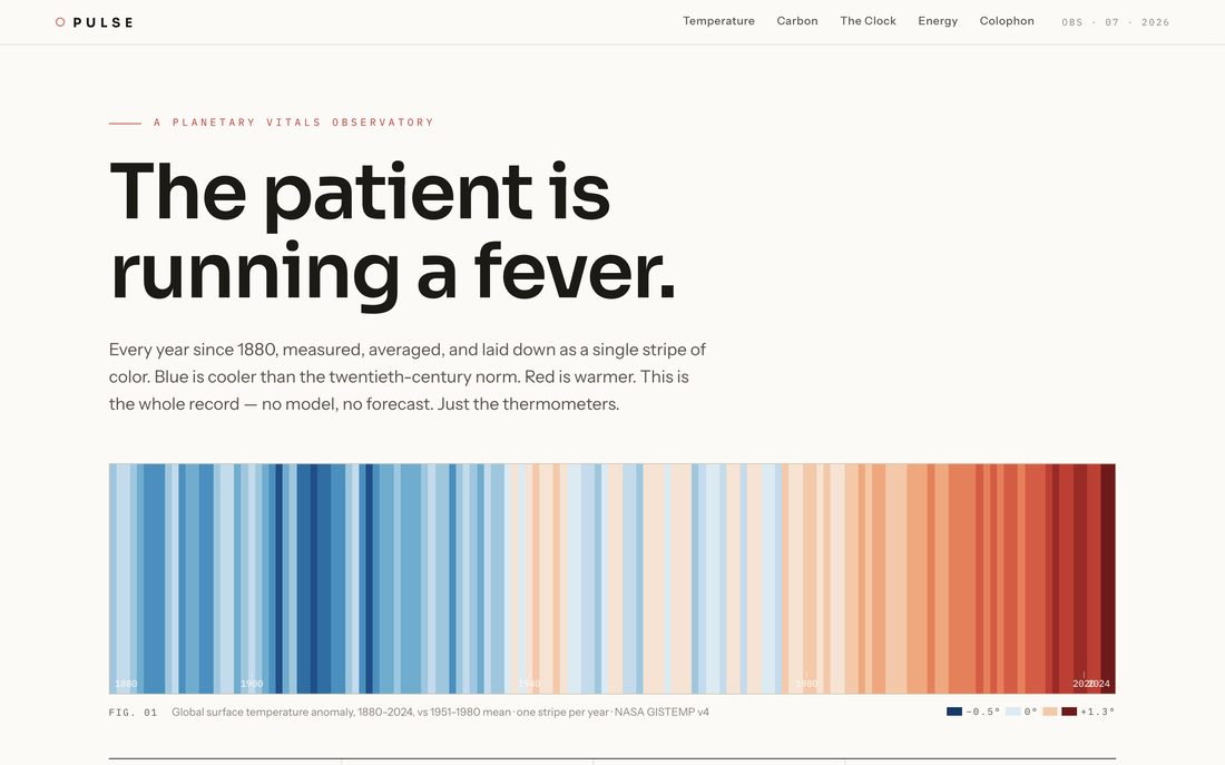
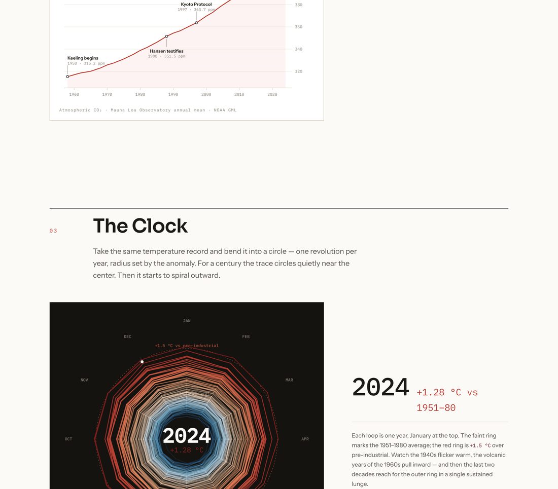
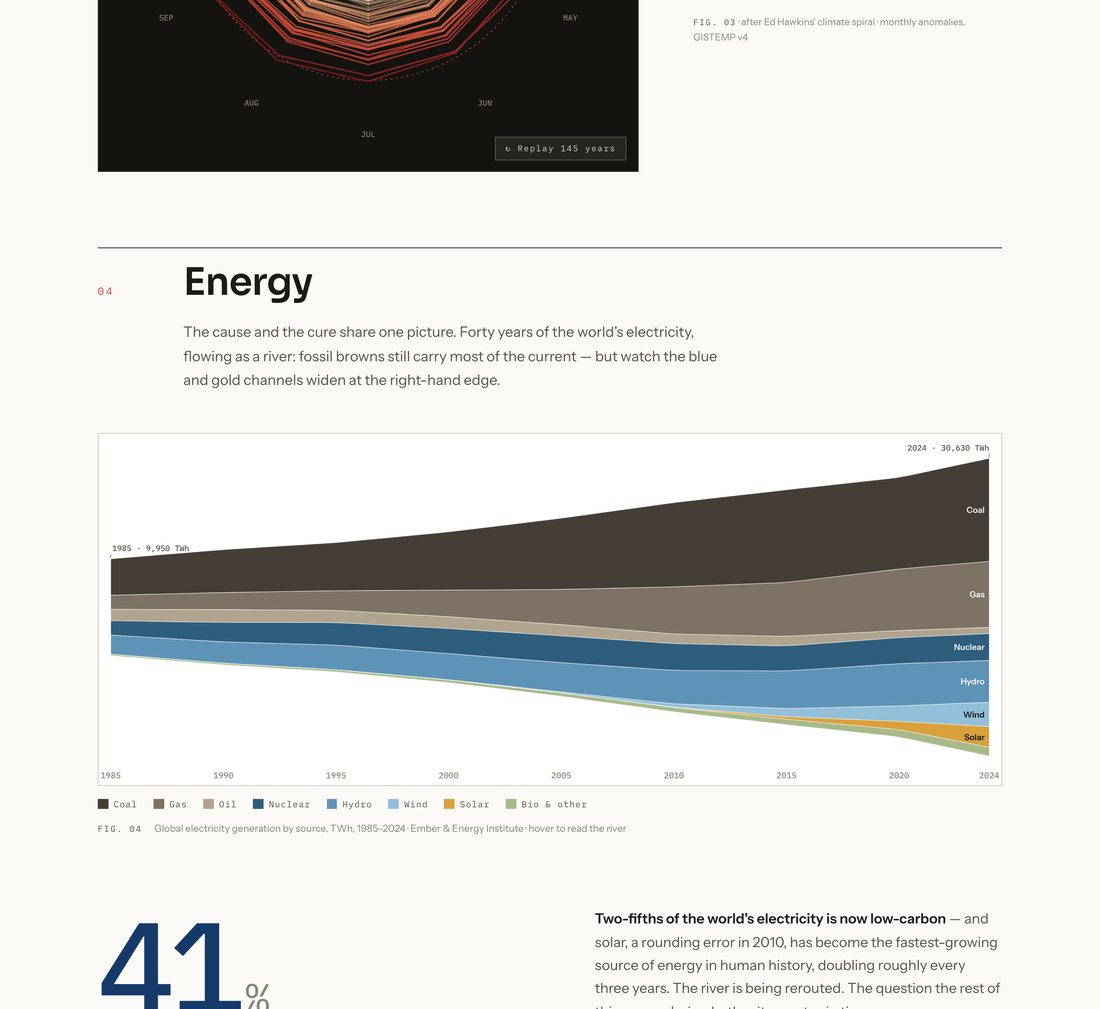
The site is pure static HTML, CSS, and vanilla JavaScript. The warming stripes, radial climate spiral, streamgraph, and sparklines are Canvas 2D, sized against devicePixelRatio for crisp lines. The Keeling curve is SVG, drawn with the classic stroke-dasharray / dashoffset trick and scrubbed by scroll: a position: sticky graphic, five narrative steps, and a scroll handler that maps section progress to the year 1958–2024, revealing annotations as the line passes them. Counters, reveals, and chart triggers all run on IntersectionObserver. Type is Sora, Instrument Sans, and IBM Plex Mono with tabular figures, served from fonts.bunny.net. prefers-reduced-motion renders every chart complete and skips all animation. Data is transcribed from NASA GISTEMP, NOAA GML, Ember, NSIDC, and NASA altimetry, with interpolated in-between years — approximations are disclosed in the colophon.
03 · ProcessThree passes, screenshots between each
The build ran as a loop: write, serve locally, screenshot at desktop and 390px mobile widths, read the screenshots, then critique and fix.
- Pass one stood up the full skeleton — all six sections, all five charts working — and caught real bugs the screenshots exposed: a duplicate
id="clock"that handed the canvas code a<section>, year labels colliding at the stripes' right edge, and white-on-pale-stripe text failing contrast. - Pass two was the taste pass: ink-on-paper label chips for the stripes, a warming-gradient scroll-progress bar in the masthead, total-TWh annotations on the streamgraph, a pulsing head dot on the Keeling curve, an ECG trace drawn into the coda.
- Pass three polished detail density — ring labels lifted onto dark chips so the spiral can't swallow them, sub-sampled spiral segments so loops read as curves instead of twelve-gons — then verified the live deploy at desktop and 390 px widths.
04 · Reproduce itPrompting an agent to build this
The essential moves, if you want an AI agent to produce something like PULSE:
The two instructions that matter most are the last ones. Banning chart libraries forces the agent to own every pixel, and the screenshot-critique loop is where a working page becomes a designed one.